Summary
Complete redesign of the mobile apps for one of the main radio stations in Spain. The most important thing during the whole project was to keep in mind new and traditional users’ needs. The redesign had an impact of 390K new users and more than 800M page views.
Context
Cadena SER, which is celebrating in 2024 its 100 years of history, is one of Spain’s main traditional radio stations. It has more than 4 million daily listeners. It’s a reference in news and sports and they also have programs and podcasts about all kind of topics.
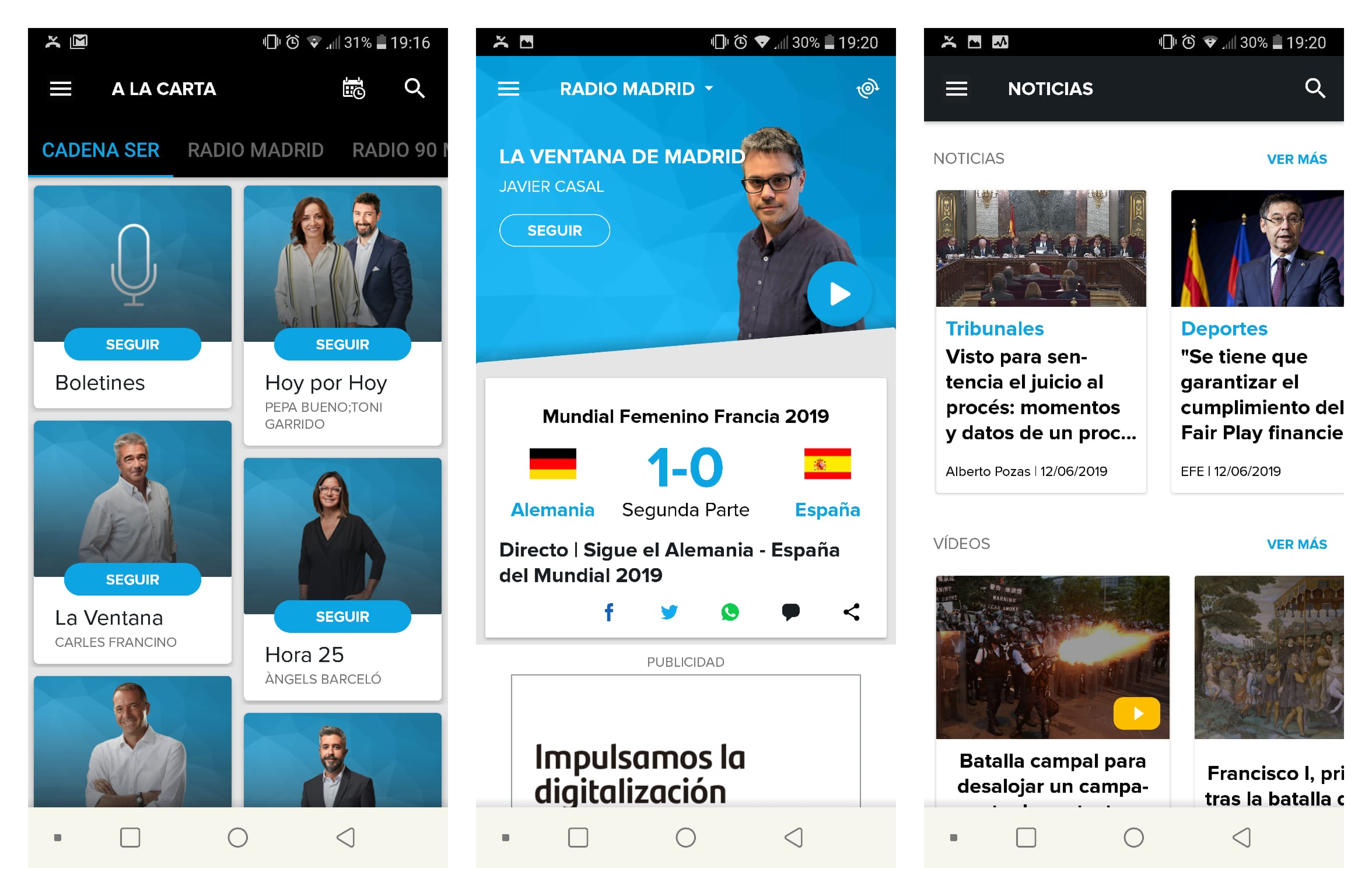
They already had an app, used by more than 100K daily listeners. It had evolved without clear leadership or ownership so there were a lot of features but they were not easy to find or use. Moreover, the visual design was not aligned with the brand, many users didn’t relate the app with Cadena SER at all.
Project goals
- Make information quick to find, allowing the user to reach it in the first 30 seconds of app use.
- Increase time on app. Most of the revenue comes from advertising in app so more time means more money.
- Gain customer loyalty by being able to customize contents and giving relevant information about programs and episodes. Most of the content was available in other platforms, like Youtube or podcast tools, but then there was not advertising revenue. They estimated that less than 10% of plays were in the apps.
Traditional and new users
There was already some research work that we could use. One of the main conclusions was that there were two main users of the app: the traditional and the new one.
The traditional user represented about the 68% of the total users and it had a clear need: “I only want to listen to the radio”. Most of the reviews both in iOS and Android complained about the complexity of something so simple, a lot of users preferred to use generic radio apps.
On the other hand, new users were the clear target of some programs that Cadena SER was starting to produce at the time. The most famous one was «La vida moderna» with David Broncano. In spite of being a national success, it didn’t increase downloads or traffic in the apps and Cadena SER didn’t know why.
We conducted some workshops with both kinds of users to understand more about what they needed and how they used the app at the moment:
| Traditional | New |
|---|---|
| Less technical. Most of them only used mobile phone and computer. | Highly technical. They use a lot of devices to be constantly online. |
| Journalist are like “old friends”. They don’t listen the program but the journalist and they are loyal to them if they switch radio stations. | Many of them never used a radio. Some users didn’t even know that David Broncano’s program was Cadena SER’s. |
| They want to be informed both national and locally. Sport news are very important for most of the users and they highlight Cadena SER as a model. | They want to know about new relevant content for them and being recommended. One of the topics they are more interested in is humor. |
| The most used feature for them is “Direct listening” (live broadcast). They use the app to be able to listen to the radio when they are not at home. | They are used to availability and customization. Most of the content they consume is on demand and they value a lot features like being notified about shows they follow. |
Three homes, one for each purpose
We needed to combine users with a sole need (listen to the radio) with users that needed to access to a lot of content and customize their preferences in order to receive relevant recommendations.
So we decided to create three different spaces: Discover, Listen and Customized space.

Each one of them has a clear purpose and is easy to access from the app.
- The central space was the principal one, the initial screen when the user enters the app. It contains the live broadcast with a station switcher and the news in a timeline, ordered by most recent so the user can be informed about global and local content.
- Swiping to the left the user accesses to all the content that Cadena SER produces, ordered by topic and with a powerful searcher to help them to discover programs and podcasts.
- Swiping to the right there’s the personalized space where the user can find recommendations based on what they have already listened to, journalists they follow and topics that they’re interested in, so they can find their new favorite program. This space also contains the programs the user follows and the user is notified when a new episode is available.
The goal with this navigation was to create specific spaces for both user and business needs: discovery (give more relevance to audio on demand), keep live broadcast as the main feature and add strong customization (time on app + loyalty)
We wanted to keep a clean home and give relevance to the key information in each space, to achieve the 30 seconds time to find the information and help traditional users, that don’t have an interest in the rest of the features.
It was a design decision based on a behavior we observed during the research phase, stakeholders interviews and the old app analysis: everybody wanted to be at first level. At the moment, there was a burger menu with a very long list of elements, not ordered neither hierarchized. We designed the navigation in a way that didn’t allow to add elements without any control, to avoid having the same mess in a few months after the redesign.
Design
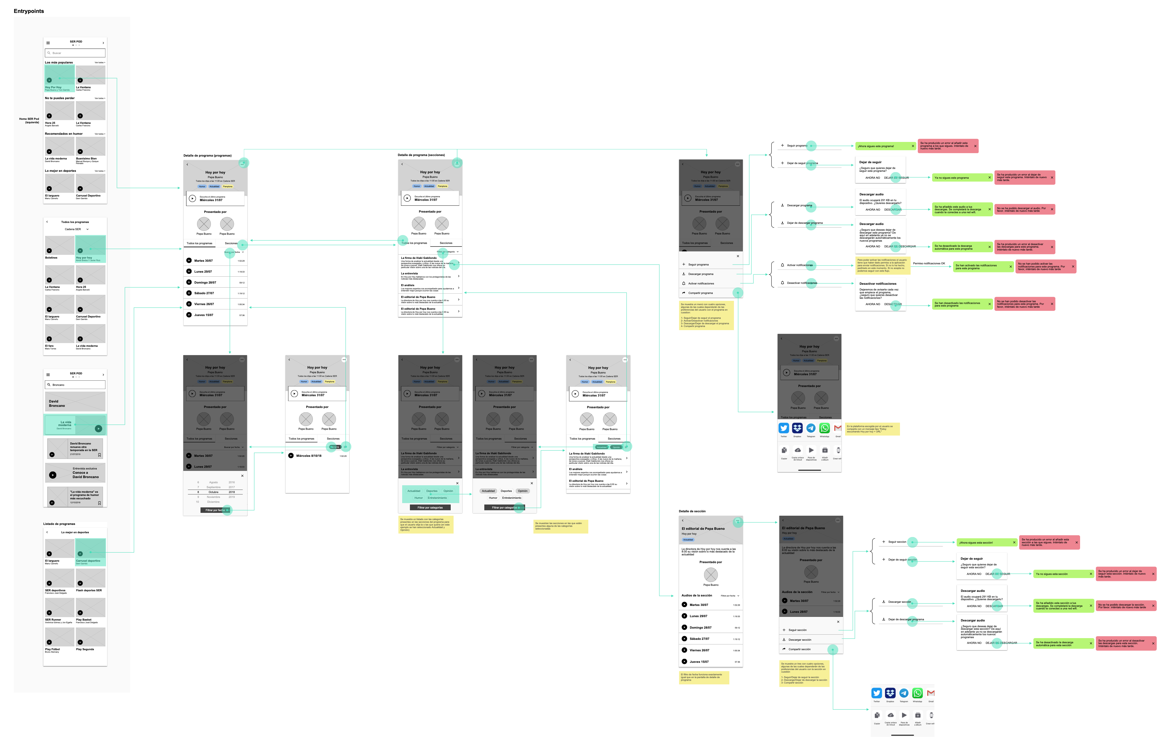
From the three spaces idea, we planned all the app navigation, trying to focus in clean the main screens like player and hide the options in a deeper level.
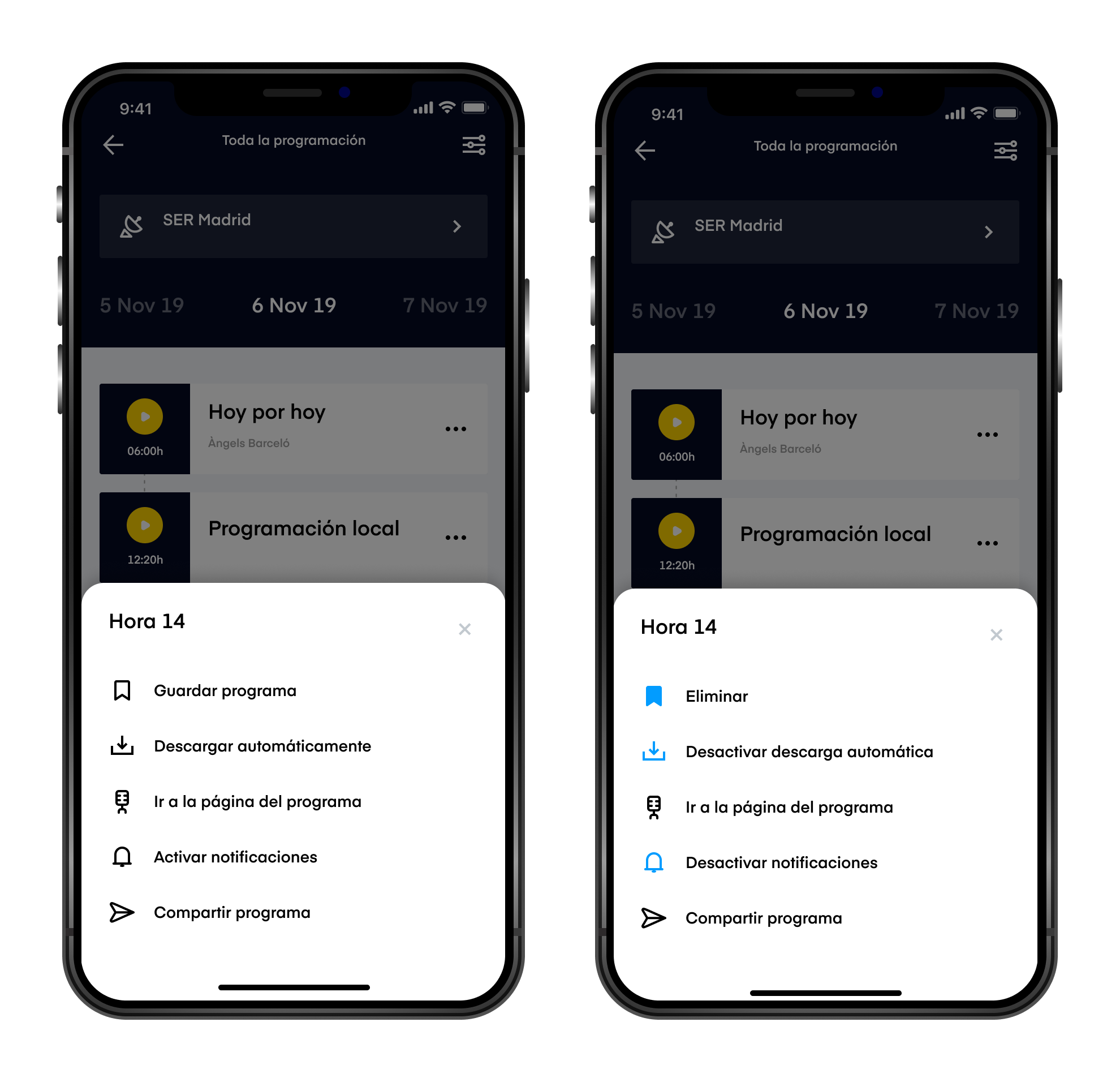
We learned at the research that traditional users had problems understanding some options in the app because it had many icons without any explanation. We decided to add text and use color in all secondary menus to explain the options and states (Activate/Deactivate).
The most important thing to have in mind was to focus in designing complex features to add value for new users and simple interactions to give traditional users a friendly app.

Key learnings
One of the challenges in this project was to have in mind two very different users in the same product taking into account their needs and context. We made a real prioritization and design exercise to clean the user interface as much as we could to offer an easy experience for less technical users.
But I’d say my biggest learning was about project management in projects that involve companies with a complex internal hierarchy. We were only allowed to present the project the person that was in charge of presenting internally to the board that gave feedback and took the decisions, not the board itself. So we needed to be sure she understood the decisions in order to defend them in front of the board (not being a designer). Being able to understand the company you are working with, and speak directly with the people who takes the decisions is usually very related to the success, but we learnt that it’s not the only way.
Thanks for reading!
I hope you enjoyed, feel free to reach me if you want more information, give some feedback or have a coffee and talk about product design 😊
Here you have some more projects I’ve participated over the past few years